The Forever House: A Fad-Free Home that ‘Holds Real Life Comfortably and Beautifully’
Here at Remodelista, we come upon quite a few projects that are second homes. It makes sense: people want their weekend property to be an escape from the stress of daily life, and so they pour all their aspirations into designing a welcoming, immaculate, serene retreat. While we love seeing these country houses and beach bungalows and pied-à-terres, what we most admire are the bursting-with-life forever homes that come across our desks.
Recently, we spotted such a home by Field Day Studio. Designed for a young family of four in East London, the modestly sized Victorian terraced home brims with color and personality, but not at the expense of taste and style. Cofounders Jessica Gibbons and Kat Turner named the project “Forever Is Composed of Nows,” which, they say, “speaks to the idea that a lasting home is built from the quality of everyday moments.”
“[The clients] both have busy lives, so home needed to feel like a proper moment to exhale,” they continue. “They’re thoughtful, curious people, with strong instincts and a clear sense of what they’re drawn to, which made the process incredibly rewarding.” And what, exactly, were their clients drawn to? Confident colors, midcentury modern furniture, and unfussy designs that work for every member of the family. “When decisions are rooted in real life rather than trends, the result feels authentic and lasting.”
Let’s take a tour, shall we?
Photography by Dean Hearne, courtesy of Field Day Studio.
 Above: The view from the living room to the entry hall. The designers’ use of color in the home is bold but judicious. “The scheme that resulted was collaborative and thoughtful and considered the architecture, the quality of light, as well as their appetite for a statement and restraint. We test everything in situ and think carefully about how colors relate from room to room, so even the stronger tones feel connected and calm rather than decorative for the sake of it.”
 Above: “Usually there’s one strong move in a room and the rest supports it through texture, tone, or material. We pay close attention to undertone and depth, so colors feel grounded rather than loud.” The molding and ceiling are painted in Paint & Paper Library’s “Canvas V“; the fireplace surround is painted in its “Caddie“; while the door on the right is painted in “Dinner Party” by Benjamin Moore. The vintage chair has been reupholstered in Colefax and Fowler fabric.
 Above: The unpretentious kitchen is housed in the new rear extension. The cabinets are painted in Farrow & Ball’s “Joa’s White.” The classic white tiles lining the wall are from Claybrook.
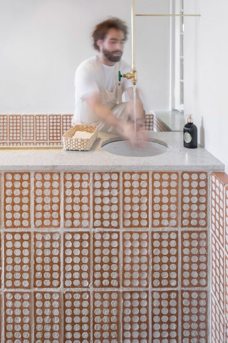
 Above: Terracotta floors, a custom-made dark wood island, a wood hutch, and stools by Ercol all lend the space warmth. (Curious about the stainless steel carbonator on the counter? Read Is It Worth It: The Aarke Countertop Premium Carbonator from Sweden.)
 Above: “The rear extension created the opportunity for a much more generous kitchen and dining space with a stronger connection to the garden.” It’s the designers’ favorite room. “It’s where the everyday happens—meals, conversations, homework, gatherings. In many ways, it embodies our design concept: It’s a space designed not just to look good, but to hold real life comfortably and beautifully.” The walls here are painted in Farrow & Ball’s “Dimity.”
 Above: In the new pantry, the designers created a gingham pattern on the walls using blue, white, and gray Moroccan tiles from Mosaic Factory.
 Above: The pantry (at right) peeks out into the playroom. Jessica and Kat, mindful that the couple’s young daughters would one day outgrow this space, selected a palette that is both fun and sophisticated. Paint & Paper Library’s burnt orange “The Long Room” tempers the electric green of Fenwick & Tilbrook’s “Kelp” on the fireplace. The vintage armchair was reupholstered in fabric by GP&J Baker.
 Above: The walls in the main bedroom are painted a more muted color: Little Greene’s “Galette.” The bedside lamp is by Birdie Fortescue; the ceiling light is Watt & Veke.
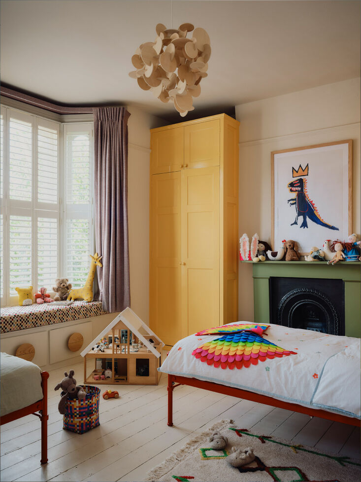 Above: The girls’ bedroom has been painted in Paint & Paper Library’s “Stone II“; the armoire, in Benjamin Moore’s “Golden Groves“; the fireplace, in Paint & Paper Library’s “The Botanist.” The cool pendant light is Normann Copenhagen’s “Bau.”
 Above: The guest room with wood floors painted in Little Greene’s “Puck.”
 Above: The groovy bathroom, thanks to a lemon yellow vintage sink and bath tub. (Colorful bathroom fixtures are a trend we’ve noticed this year: See Color Trend Alert: 12 Bathrooms with Fixtures that are Everything but White.)
For more on eclectic homes, see:
Categories
Recent Posts